I’ve wanted to reformat and redesign Recipes for Disaster for more than five years. Shortly after the dust had settled from the second printing, I had enough distance from working on the first edition to start noticing its flaws, or, more accurately, the mistakes I’d made. However, recognizing imperfections and failed objectives isn’t the same as finding solutions, and for years I’ve lived with the book, handling it nearly every day, sending out tens of thousands of copies to people and coordinating subsequent printings—all the while feeling like it wasn’t the absolute best version we could make. I made notes, registered feedback from readers, tinkered with prototype templates in InDesign, and—more than anything else—fretted. Today we announce the availability of the newly redesigned second edition, and holding it in my hands fills me with more than just relief, but also the sweet feeling of satisfaction. We really got it right.
What follows is a beyond-nerdy breakdown of the changes made in the second edition, the reasoning behind the changes, and a look into what led to the shortcomings of the first edition. To do that we’ll have to travel back to 2004, but first we’ll show off a few of the improvements …
Improvements in the Second Edition
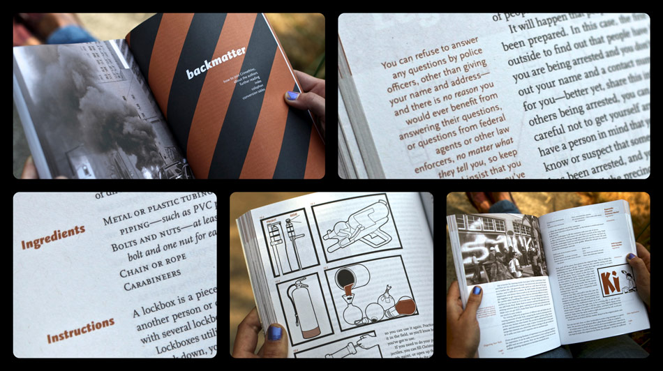
Comprised of the same content as the first edition, the second edition has been completely reformatted, starting with its larger page size of 7” x 10”, resulting in a reduced page count from 624 down to 400, and culminating in a book that has a natural balance and is easier to handle and read. In addition, it’s bound using the Otabind method which allows it to lay flat effortlessly, particularly helpful when used as a guide for a task that requires your hands to be free. Both the new size and binding also help make the book extremely durable.
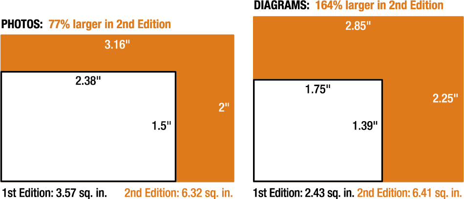
The larger images are perhaps the most noticeable improvement: the 152 standard photos and diagrams are 77% and 164% larger, respectively; additionally, a dozen images have been blown-up to half-page size.

Despite using 4% less paper than the first edition, not only does the second edition include larger images throughout, it also adds twenty-one new photos and a new introduction. It was possible to add content while reducing the overall size by using a more efficient page size with column widths better suited for the task at hand.
While the second edition is a total reformatting of the book, the redesign is only an iteration and refinement of the original design. The primary text has been re-set with improved typography in a narrower column to make for a more readable text. The secondary column has also been narrowed to use the space more efficiently and provide a more complimentary visual presence. The larger page size also allows for more flexibility and discretion in the placement of images and sidebar tips for a less cluttered look and more relevant placement of these ancillary items.

What Went Wrong the First Time
Firstly, as a self-taught designer my only instruction has been through experience and reflection, both of which I’ve accrued a lot more of in the past eight years. In 2004, Recipes was the second large book I’d ever designed and the first with the complicated set of technical requirements demanded by this content—it’s quite the opposite of the first book I worked on, Days of War, both in it’s rigid structure and the role the design itself was to play in the final presentation. The challenge was to present the information as clearly as possible with minimal distraction and maximum utility while still being visually appealing, with the task of conveying a certain energy and mood being completely secondary. With no budget and a desire to make the book available as soon as possible, I figured things out as I worked on the final, and only, design stage. When I was done, I had learned quite a bit, but I was also finished—unless I wanted to start over at the beginning (which, in fact, I decided to do eight years later). In hindsight, I stuck too rigidly to a format that was also too rigid itself; prioritizing uniformity and grid-like structure at the price of failing to impose a bolder, more expressive style.
Secondly, it was the first project I’d done with the ‘new’ Indesign CS 1.0 (previously I had used PageMaker, which had been killed off by Adobe), and both I and the program were very raw. There was a steep learning curve, and InDesign itself lacked many of the features that today I take for granted—such as the Adobe Paragraph Composer, which looks at all lines in paragraph when deciding how to split each line in a justified column of text to minimize disruption of letter spacing and reduce the number of hyphens. By simply using the current version of InDesign, the entire 200,000+ words of the text are set in a much more legible and efficient manner, greatly enhancing readability. And by taking advantage of various subsequently added capabilities, the design can be implemented with increased precision and ease, leaving more time and energy to devote to the nontechnical aspects of the work.
Lastly, and most consequentially, I committed a classic novice error: I became focused on a single design concept, committed to the idea beyond any pragmatic concerns, leading me to ignore that the concept wasn’t fully compatible with other principles that were equally, if not more, important to producing the best version of the book.
One of the design requirements was to have two vertical columns on each page, one primary column for the main text, and a second, smaller column on the outside edge of the page, home to section titles, tips, footnotes, and the running footer. This meant we could not do the portrait-oriented 5.5” x 8.5” format like our first book Days of War because the page would be too narrow to accommodate two columns. We brainstormed the idea of doing the book the same size, but making it landscape orientation by binding it on the short side (instead of the long side as books are traditionally bound). The unconventionality was too delicious for us to pass up, and we were thrilled to try something that we’d never seen done before. Plus, it’d be the shape of a brick.
Once we decided on that format, I never again considered another until this redesign, even when I ran into serious limitations during the design process. We finished the book, and it was good enough and people have seemed to like it. In fact, we’ve never received a single complaint about the design or format. But I can’t look at the first edition without seeing compromises on every page, the product of a stubborn designer just learning his craft.
Mistakes Are Great Teachers, But Not Kind
Over the last decade I’ve learned to be able to discard a good idea if it isn’t right for the project being worked on, even if tons of time and energy have been invested in it already—it’s a hard lesson to learn, but one that is essential for a designer. Some ideas require much hard work just to reach the point of consideration, but the hardest part is to look at the result honestly, and be ready to discard it if it doesn’t feel right. Finding yourself saying “Aw, fuck. Well that didn’t work like I thought it would,” is the truest sign that you are on the right track. It means you will recognize Good when you see it, and that you aren’t going to settle for less. The following list documents an occasion where I was too attached to an idea to discard it.
In our quest to use a wider page by switching to 8.5” x 5.5” in landscape orientation, we ended up with a page that was too wide for the two-column scheme we had decided upon. Needing to utilize the full width of the page, we ended up making the main text column too wide. I was concerned with this even at the time, but felt as though I couldn’t make it any more narrow than I already had without making the secondary outside column too wide itself, and thus wasting too much space on each page. At the optimum size for the typeface we were using, the five inch column width was simply too many characters per line, a basic typesetting mistake that hinders readability. Research shows that our eyes have a difficult time navigating from the end of one line to the beginning of the next when they are too far apart, so our brain has to spend a few extra nanoseconds figuring out where the next line starts and our reading slows and comprehension decreases.
And by attempting to make the main text column as narrow as I thought it needed to be (which ultimately still wasn’t narrow enough), I made the secondary column too wide also. Much space was wasted here as the section titles did not utilize the full width, and there was plenty of unused space in the secondary columns on 99.5% of the pages. This meant that a narrower secondary column would have been adequate and much more efficient; having the secondary column so wide ended up wasting tons of space.
Having the wider-than-it-needed-to-be-or-should-have-been secondary column combined with an over-the-top devotion to the grid structure of the book led me to decide that the photos in the books had to be contained entirely in the sidebar. Which meant they had to be small. Very small. Too small. Same things goes for the diagrams, but with even more disastrous results.
Lastly, the page size was too small for a book of such length. As page size decreases, the percentage of the page taken up by margins increases because larger pages don’t need proportionately larger margins. This means that for a book that is naturally going to be very long— where the design aim would be to actually reduce the total volume and weight—a larger page size is better, because it is more efficient.
The final problem with the format was only discernible after the book was produced—with its unusual, oblong shape and having more than six hundred pages of heft, the book had poor balance and was simply unwieldy to hold and read. A book that’s hard to read? Why, I do believe that’s a book due for a second edition.


